Principles of good GUI Design
Graphical user interfaces (GUIs) have become the user interface of choice.
Yet despite the GUI's popularity, surprisingly few programs exhibit good
interface design. Moreover, finding information explaining what constitutes a
good and intuitive interface is exceedingly difficult. In this article, I
describe the basic rules for all good interfaces -the cardinal dos and don'ts.
However, before starting in on what constitutes good design, I need to
explain the causes of bad design. This way, if you are tempted to deviate from
the tried and true, you'll know where the wrong path leads -and, I hope, get
back to good design.
Forgetting the User
Developers often design for what they know, not what the users know. This
age-old problem occurs in many other areas of software development, such as
testing, documentation, and the like. It is even more pernicious in the
interface because it immediately makes the user feel incapable of using the
product. Avoid this error diligently.
Give Users Control
GUI designers' predilection for control is evident in applications that
continually attempt to control user navigation by graying and blackening menu
items or controls within an application. Controlling the user is completely
contradictory to event-driven design in which the user rather than the software
dictates what events will occur. As a developer, if you are spending a lot of
time dynamically graying and blackening controls, you need to re-examine your
design approach and realize that you may be controlling the user, who may not
want to be controlled. As business changes at a faster pace, flexibility in user
interfaces will become a key enabler for change. Allowing the user to access the
application in ways you never dreamed can be scary, but satisfying for you as a
developer and empowering for the user.
Too Many Features at the Top Level
Examine a VCR built in 1985 and then examine one built in 1995. You will see
a startling difference in the interface of the two models. The model built in
1985 will have an abundance of buttons readily available on the faceplate of the
unit, many of which will remain a mystery since the manual was lost years ago.
The 1995 model will have only a few buttons for the key features people use:
play, fast-forward, reverse, stop, and eject. This model will probably have even
more features than the model built a decade before, yet the features will be
cleverly tucked away behind a drop-down panel or sliding door, accessible when
needed but not staring you in the face.
Likewise, you should ensure that features used frequently are readily
available. Avoid the temptation to put everything on the first screen or load
the toolbar with rarely used buttons. Do the extra analysis to find out which
features can go behind the panel instead of on the faceplate.
GUI Successes
Now, let's discuss some GUI successes. Successful GUIs share many common
characteristics. Most importantly, good GUIs are more intuitive than their
character-based counterparts. One way to achieve this is to use real-world
metaphors whenever possible. For example, an application I recently examined
used bitmaps of Visa and MasterCard logos on buttons that identified how a
customer was going to pay. This graphical representation was immediately
intuitive to users and helped them learn the application faster.
Another important characteristic of good GUIs is speed, or more specifically,
responsiveness. Many speed issues are handled via the design of the GUI, not the
hardware. Depending on the type of application, speed can be the make-or-break
factor in determining an application's acceptability in the user community. For
example, if your application is oriented toward online transaction processing (OLTP),
slow performance will quickly result in users wanting to abandon the system.
You can give a GUI the appearance of speed in several ways. Avoid repainting
the screen unless it is absolutely necessary. Another method is to have all
field validations occur on a whole-screen basis instead of on a field-by-field
basis. Also, depending upon the skills of the user, it may be possible to design
features into a GUI that give the power user the capability to enter each field
of each data record rapidly. Such features include mnemonics, accelerator keys,
and toolbar buttons with meaningful icons, all of which would allow the speed
user to control the GUI and rate of data entry.
Dos And Don'ts
Every good developer should have the goal of designing the best GUIs
possible. But how does a developer make this goal a reality? By following sound,
proven GUI design principles such as those listed in the following sections.
Like any good professional, YOU need some rules for repeatable successful
designs. We have used the principles offered here for work with our own
customers and have taught more than 20,000 GUI-design students nationally and
internationally. These principles should help you as well.
Understand People
Applications must reflect the perspectives and behaviors of their users. To
understand users fully, developers must first understand people because we all
share common characteristics. People learn more easily by recognition than by
recall. Always attempt to provide a list of data values to select from rather
than have the users key in values from memory. The average person can recall
about 2,000 to 3,000 words, yet can recognize more than 50,000 words.
Be Careful Of Different Perspectives
Many designers unwittingly fall into the perspective trap when it comes to
icon design or the overall behavior of the application. I recently saw an icon
designed to signify "Rolled Up" totals for an accounting system. To signify this
function, the designer put much artistic effort into creating an icon resembling
a cinnamon roll. Unfortunately, the users of the system had no idea what
metaphor the icon was supposed to represent even though it was perfectly
intuitive from the designer's perspective. A reserved-icons table containing
standard approved icons, such as the one shown in Figure 1, will help eliminate
these problems.
Reserved Icons
Figure 1
| Picture |
Meaning and Behaviour |
Use to Identify an Application |
Used to Identify a Function |
Reserved Word Text Label |
 |
Information Message |
No |
Yes
(identifies Information message box) |
None |
 |
Warning Message |
No |
Yes
(identifies Warning message box) |
None |
 |
Question Message |
No |
Yes
(identifies question message box) |
None |
 |
Error Message |
No |
Yes
(identifies error message box) |
None |
Design for Clarity
GUI applications often are not clear to end users. One effective way to
increase the clarity of applications is to develop and use a list of reserved
words. A common complaint among users is that certain terms are not clear or
consistent. I often see developers engaging in spirited debates over the
appropriate term for a button or menu item, only to see this same debate
occurring in an adjacent building with a different set of developers. When the
application is released, one screen may say "Item," while the next screen says
"Product," and a third says "Merchandise" when all three terms denote the same
thing. This lack of consistency ultimately leads to confusion and frustration
for users.
Figure 2 gives an example of a list of reserved words. An
application-development group might complete and expand the table with
additional reserved words.
List of Reserved Words
Figure 2
| Text |
Meaning And Behavior |
Appears
On Button |
Appears
On Menu |
Mnemonic
Keystrokes |
Shortcut
Keystrokes |
| OK |
Accept data entered or acknowledge information presented and remove the
window |
Yes |
No |
None |
<Return> or <Enter> |
| Cancel |
Do not accept data entered and remove the window |
Yes |
No |
None |
Esc |
| Close |
Close the current task and continue working with the application; close
view of data |
Yes |
Yes |
Alt+C |
None |
| Exit |
Quit the application |
No |
Yes |
Alt+X |
Alt+F4 |
| Help |
Invoke the application's Help facility |
Yes |
Yes |
Alt+H |
Fl |
| Save |
Save data entered and stay in current window |
Yes |
Yes |
Alt+S |
Shift+Fl2 |
| Save As |
Save the data with a new name |
No |
Yes |
Alt+A |
F12 |
| Undo |
Undo the latest action |
No |
Yes |
Alt+U |
Ctrl+Z |
| Cut |
Cut the highlighted characters |
No |
Yes |
Alt+T |
Ctrl+X |
| Copy |
Copy highlighted text |
No |
Yes |
Alt+C |
Ctrl+C |
| Paste |
Paste the copied or cut text at the insertion point |
No |
Yes |
Alt+P |
Ctrl+V |
Design for Consistency
Good GUIs apply consistent behavior throughout the application and build upon
a user's prior knowledge of other successful applications. When writing software
for business applications, provide the user with as many consistent behaviors as
possible. For example, both the Embassy Suites and Courtyard Marriot hotel
chains are growing rapidly due to their popularity among business travelers who
know they will be provided with a familiar room and a consistent set of
amenities. The bottom line is that business travelers are not looking for a new
and exciting experience at each new city. Business users of your software have
similar needs. Each new and exciting experience you provide in the software can
become an anxiety-inducing experience or an expensive call to your help desk.
Provide Visual Feedback
If you've ever found yourself mindlessly staring at the hourglass on your
terminal while waiting for an operation to finish, you know the frustration of
poor visual feedback. Your users will greatly appreciate knowing how much longer
a given operation will take before they can enjoy the fruits of their patience.
As a general rule, most users like to have a message dialog box with a progress
indicator displayed when operations are going to take longer than seven to ten
seconds. This number is highly variable based on the type of user and overall
characteristics of the application.
Provide Audible Feedback
Last week, I had the opportunity to ride in elevators in which a pleasant
voice informed riders which floor they were on. The building was fairly new, and
at first, employees thought the voice was cute. After six months of traveling
floor to floor, employees ignore the voice and see it as more of an annoyance
than a help. The same thing can happen with your GUls, except the annoying
sounds are not contained within the walls of an elevator, but instead are
available to everyone within earshot of the worker's cubicle. Put sound on a few
hundred workstations, and a real cacophony emerges in the open-air cubicle
environment. However, audible feedback can be useful in cases where you need to
warn the user of an impending serious problem, such as one in which proceeding
further could cause loss of data or software. Allow users to disable audio
feedback, except in cases when an error must be addressed.
Keep Text Clear
Developers often try to make textual feedback clear by adding a lot of words.
However, they ultimately make the message less clear. Concise wording of text
labels, user error messages, and one-line help messages is challenging. Textual
feedback can be handled most effectively by assigning these tasks to experienced
technical writers.
Provide Traceable Paths
If your users ever say something akin to, "I don't know how I got to this
window, and now that I'm here, I don't know how to get out," then you have not
provided a traceable (or, in this case, retraceable) path. Providing a traceable
path is harder than it sounds. It starts with an intuitive menu structure from
which to launch your specific features.
You must also identify areas where you can flatten the menu structure and
avoid more than two levels of cascading menus. Providing a descriptive title bar
within each dialog box will help greatly to remind the user what menu items or
buttons were pressed to bring them to the window now in focus.
Provide Keyboard Support
Keyboards are a common fixture on users' desktops and provide an efficient
means to enter text and data. With the introduction of GUI applications, we
often assume users will embrace a mouse as the primary interactive device. This
can become time-consuming and inefficient for the touch typist or frequent users
of your application.
Keyboard accelerators can provide an efficient way for users to access
specific menu items or controls within a window. The accelerators used should be
easy to access and limited to one or two keys (such as F3 or Ctrl-P). Keyboards
have limitations in the GUI world, such as when trying to implement
direct-manipulation tasks like drag and drop, pointing, and resizing.
In contrast, you will always find a smaller set of users who are not touch
typists and hence embrace the mouse as a point-and-click nirvana. The result is
that you need to provide complete and equal keyboard and mouse support for all
menu and window operations.
Watch the Presentation Model
A critical aspect that ties all these facets of the interface together is the
interface's look and feel. The look and feel must be consistent. On the basis of
users' experiences with one screen or one dialog box, they should have some
sense of how to interact with the next screen or control.
Searching the interface model for good design and continuity is most
important. The model should involve careful decisions, such as whether the
application will have a single or multiple document interface. The model also
will validate how users perform their main tasks within the application.
Identifying the appropriate presentation for the application will greatly
facilitate the subsequent windows being developed since they will have a common
framework to reside in. On the other hand, if you do not define the presentation
model early in the design of your GUI, late changes to the look and feel of the
application will be much more costly and time-consuming because nearly every
window may be affected.
Modal vs. Modeless Dialogs
When we need input from the user, we often use a modal dialog box. Using
modal dialogs has long been shunned by many developers as too constraining on
the user. However, modal dialogs do have many uses in complex applications since
most people only work on one window at a time. Try to use modal dialogs when a
finite task exists. For tasks with no fixed duration, modeless dialogs will
normally be the preferable choice with a major caveat: Try to keep the user
working in no more than three modeless windows at any one time. Go beyond this
magical number and the support-desk phones will start ringing as users spend
their time managing the various open windows rather than concentrating on their
tasks. Use the table in Figure 3 to determine the appropriate use of dialog
boxes and windows.
When to Use Dialog Boxes Or Windows
Figure 3
| Type |
Description |
Use |
Example |
| Modal |
Dialog box |
Presentation of a finite task |
File Open dialog box
Save As dialog box |
| Modeless |
Dialog box |
Presentation of an ongoing task |
Search dialog box
History List dialog box
Task List dialog box |
| Applicaton Window |
Window frame with document
(child) windows contained within |
Presentation of multiple instances of an object
Comparison of data within two or more windows |
Word Processor
Spreadsheet |
| Document Window |
Modeless dialog box or document window contained within and managed by
Application window |
Presentation of multiple parts of an application |
Multiple views of data (sheets) |
| Secondary Window |
Primary window of a secondary application |
Presentation of another application called from parent |
Invoke Help within an application |
Control Design
Controls are the visual elements that let the user interact with the
application. GUI designers are faced with an unending array of controls to
choose from. Each new control brings with it expected behaviors and
characteristics. Choosing the appropriate control for each user task will result
in higher prodtictivity, lower error rates, and higher overall user
satisfaction. Use the table in Figure 4 as a guideline for control usage in your
screens.
Guidelines For Using Controls
Figure 4
| Control |
Number Of Choices In Domain Shown |
Type Of Controls |
| Menu Bar |
Maximum 10 items |
Static action |
| Pull-Down Menu |
Maximum 12 items |
Static action |
| Cascading Menu |
Maximum 5 items, 1 cascade deep |
Static action |
| Pop-up Menu |
Maximum 10 items |
Static action |
| Push-button |
1 for each button, maximum of 6 per dialog box |
Static action |
| Check Box |
1 for each box, maximum of 10 to 12 per group |
Static set/select value |
| Radio Button |
1 for each button, maximum of 6 per group box |
Static set/select value |
| List Box |
50 in list, display 8 to 10 rows |
Dynamic set/select value |
| Drop-down List Box |
Display 1 selection in control at a time, up to 20 in a drop-down box
|
Dynamic set/select single value |
| Combination List Box |
Display 1 selection in control at a time in standard format up to 20 in
a drop-down box |
Dynamic set/select single value; add value to list |
| Spin Button |
Maximum 10 values |
Static set/select value |
| Slider |
Dependent on data displayed |
Static set/select value in range |
Finally, try to keep the basic behavior and placement of these controls
consistent throughout your application. As soon as you change the behavior of
these basic controls, your user will feel lost. Make changes thoughtfully and
apply the changes consistently.
Applying Design Principles
Understanding the principles behind good GUI design and applying them to your
applications can be a challenge. Let's examine an application to see how these
principles can result in an improved interface.
Exploring a GUI Design in Need of Redesign
The interface in Figure 5 is used by an ambulance-dispatching company to
maintain customer data, provide billing information, and dispatch ambulances.
The application was a port from a character-based system and contains several
design errors that affect the user's performance with this mission-critical
application. Keep in mind that GUI ease of use and clarity is especially
important in a critical application such as this where rapid handling of a
request can make the difference between life and death. Here is what is wrong
with this screen:
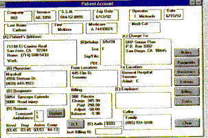 Figure 5
- Too many functions at the top level. The users requested that the
new application provide all information at their fingertips. This results in
the screen being used for both customer maintenance and ambulance dispatching.
If you enter extensive customer information and then press the Update button,
the record is updated. However, if you enter minimal customer information,
such as Social-security number, diagnosis, from-location, and to-location,
then press the Trans button, an ambulance will be dispatched. Updating and
dispatching functions need to be on separate dialog boxes.
- Too many buttons. The buttons along the right should be on the
application's parent window, possibly in a toolbar, but not on this child
window.
- Poor navigational assistance. GUI controls should be positioned
according to frequency of use. The most important field should be in the upper
left; the least important field should be in the lower right. It's hard to
imagine how the company and invoice number could be the most important fields
when dispatching an ambulance.
- Inappropriate use of controls. The designer chose to use text
labels rather than group boxes to identify which groups of data would be
placed in the boxes. This many group boxes with text labels in these positions
makes the screen appear convoluted and makes it difficult to distinguish the
data from the labels. Also, the editable fields should be identified with a
box around them so that it is intuitively obvious which fields can be changed.
- Lack of symmetry. Just lining up fields, group boxes, and buttons
will make this GUI much easier to use. Our brains like order, not chaos.
An Improved Interface
Figures 6 and 7 show a much improved interface for this same application:
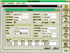 Figure 6
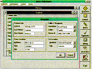 Figure 7
- Order out of chaos. This application should contain several child
windows for the different tasks a user might perform. These tasks can be
accessed easily through the Tasks menu or by pushing one button on the
vertical toolbar. The Dispatch button invokes a modal dialog box instead of a
modeless child window. That way, you can require the user to acknowledge
completion of the dispatching task. If it were a modeless window, the user
might overlay it without ever dispatching the ambulance.
- Reordering input fields. The confusing order of fields has been
more logically structured based on importance and frequency of use.
- Improved controls. The revised interface features consistent use of
data-entry fields. Any field in which a user can enter data is surrounded by a
border. Group boxes are used to group related fields together or to illustrate
a domain.
These changes, suggested by the principles we have previously discussed, make
for a clean and more intuitive interface.
Implementing Effective Standards
Once you implement some good design practices into your GUI applications, how
do you ensure others in your organization will do the same? The most
cost-effective way to ensure consistency among your GUI applications is to
implement GUI standards that are easy to use, clear, and concise. We've all
experienced the "standards" manual that is energetically distributed to
coworkers only to be placed immediately on the developer's shelf next to other
unread manuals. To ensure your standards do not meet this same fate, provide
them in an online hypertext format. Divide your standards into rules -which must
be followed or the developer will have some explaining to do- and
recommendations. Developers like to know what is mandatory and where they have
discretion.
Conclusion
Designing good GUis is a critical skill for application developers in the
1990s, regardless of the GUI platform for which they are designing. Good GUI
designs don't happen naturally. They require that the developer learn and apply
some basic principles, including making the design something the user will enjoy
working with every day. They also require that the developer get as much
experience as possible in working on and being exposed to good GUl designs.
Remember, if you apply the principles and get some experience in good GUI
design, your users will have an easier time getting their jobs accomplished
using the GUIs you produce for them.
James Hobart is a senior consultant with Corporate Computing International
(CCI), a provider of client-server and GUI services, consulting, and products.
He specializes in the design and development of large-scale, high-volume
client-server applications. He has extensive experience in GUI design for
transaction-processing systems and strategies for migration from character-based
systems. He can be reached at 70334.3064@compuserve.com.

 |
Taj OS
|
Operating System Tutorials
|
Guest Book
|
Sitemap
|
Taj OS
|
Operating System Tutorials
|
Guest Book
|
Sitemap


